
Data storytelling is the practice of transforming raw data into meaningful narratives that people can easily understand and act on. By combining data, visuals, and narrative techniques, it helps organisations explain insights clearly and communicate why the information matters.
As businesses become increasingly data-driven, storytelling has grown in importance across analytics, business strategy, and leadership. Organisations need professionals who can present complex findings in ways that support decision-making and stakeholder communication. This is especially relevant in today’s digital economy, where companies rely heavily on data to guide operations, customer engagement, and long-term planning.
From public policy and media to marketing and finance, data storytelling is now widely used across industries in Singapore. This article explores what data storytelling is, why it matters in business, practical examples in Singapore, best practices, and frequently asked questions about this increasingly valuable skill.
What Is Data Storytelling?
Data storytelling refers to the process of using data, visuals, and narrative techniques to communicate insights in a meaningful and engaging way. It involves analysing information, identifying key findings, and presenting them in a format that helps audiences understand trends, challenges, opportunities, or recommendations more clearly.
Key Elements of Effective Data Storytelling
Effective data storytelling goes beyond presenting numbers or charts. It combines analytical thinking with communication techniques to ensure that audiences understand not only the data itself, but also the significance behind it.
- Audience understanding: The presentation style, terminology, and level of detail should be tailored to the audience’s knowledge and priorities
- Clear narrative: A strong storyline helps audiences follow the data journey logically from problem to insight and recommendation
- Relevant data: The data selected should directly support the message and avoid unnecessary information that may confuse audiences
- Effective visualisation: Charts, graphs, dashboards, and infographics should simplify complex information and highlight important insights quickly
- Actionable insights: Good data stories lead to decisions, actions, or discussions rather than simply presenting information passively
Benefits of Data Storytelling: Why It Matters In Business
Data storytelling helps businesses transform complex information into insights that are easier to understand and apply. It improves communication, supports decision-making, and enables organisations to use data more effectively across departments.
Improves Decision-Making
Research by PwC found that highly data-driven organisations are three times more likely to report significant improvements in decision-making compared to organisations that rely less on data. Data storytelling helps decision-makers quickly identify key trends, risks, and opportunities without becoming overwhelmed by technical details.
Makes Complex Data Easier To Understand
Businesses often collect large amounts of information from analytics platforms, customer databases, and project management tools. Data storytelling simplifies complicated findings into visuals and narratives that stakeholders can understand regardless of their technical background.
Strengthens Stakeholder Communication
Clear storytelling improves collaboration between departments by helping teams align around shared insights and objectives. This is especially important when presenting findings to senior leadership, investors, or clients who may not have strong analytical expertise.
Supports Business Growth And Innovation
Companies that effectively communicate data insights are often better positioned to identify market trends, customer behaviour, and operational inefficiencies. In highly competitive and in-demand jobs such as business analytics and digital marketing, professionals who can tell compelling data stories are increasingly valued.
Increases Audience Engagement
People are more likely to remember stories than isolated statistics. According to research by Stanford University, stories are significantly more memorable than facts alone because narratives create emotional engagement and context. This makes data storytelling particularly useful for presentations, reports, and strategic recommendations.
Examples Of Data Storytelling in Singapore
Data storytelling is widely used across Singapore’s public sector, media landscape, and business environment to explain complex issues, engage audiences, and support informed decision-making.
Public Sector: Ministry of Finance (MOF)
The Ministry of Finance Singapore produced an animated video explaining how the COVID-19 pandemic affected the country’s fiscal position and why long-term investments remain important for future growth. Instead of relying solely on financial figures and economic terminology, the video used simple visuals, relatable examples, and a clear narrative structure to explain complex national budgeting concepts.
This is an example of effective data storytelling because it transformed economic and fiscal data into an accessible story that ordinary citizens could understand. The approach helped the public appreciate why sustainable financial planning and responsible spending are important for Singapore’s future.
Media: The Straits Times
The Straits Times has developed a strong reputation for interactive data journalism through its visual storytelling projects. One example was its feature on national sprinter Shanti Pereira, where race timings, rankings, and performance data were presented through engaging visuals and interactive graphics.
Rather than displaying statistics in isolation, the feature showed the progression of her achievements over time and highlighted the significance of her milestones. This helped readers connect emotionally with the athlete’s journey while also understanding the performance data behind her success.
Step-by-Step Guide On How To Craft A Data Story
Crafting an effective data story requires more than building charts or dashboards. Professionals need to identify the right message, understand the audience, and present insights in a structured and engaging way.
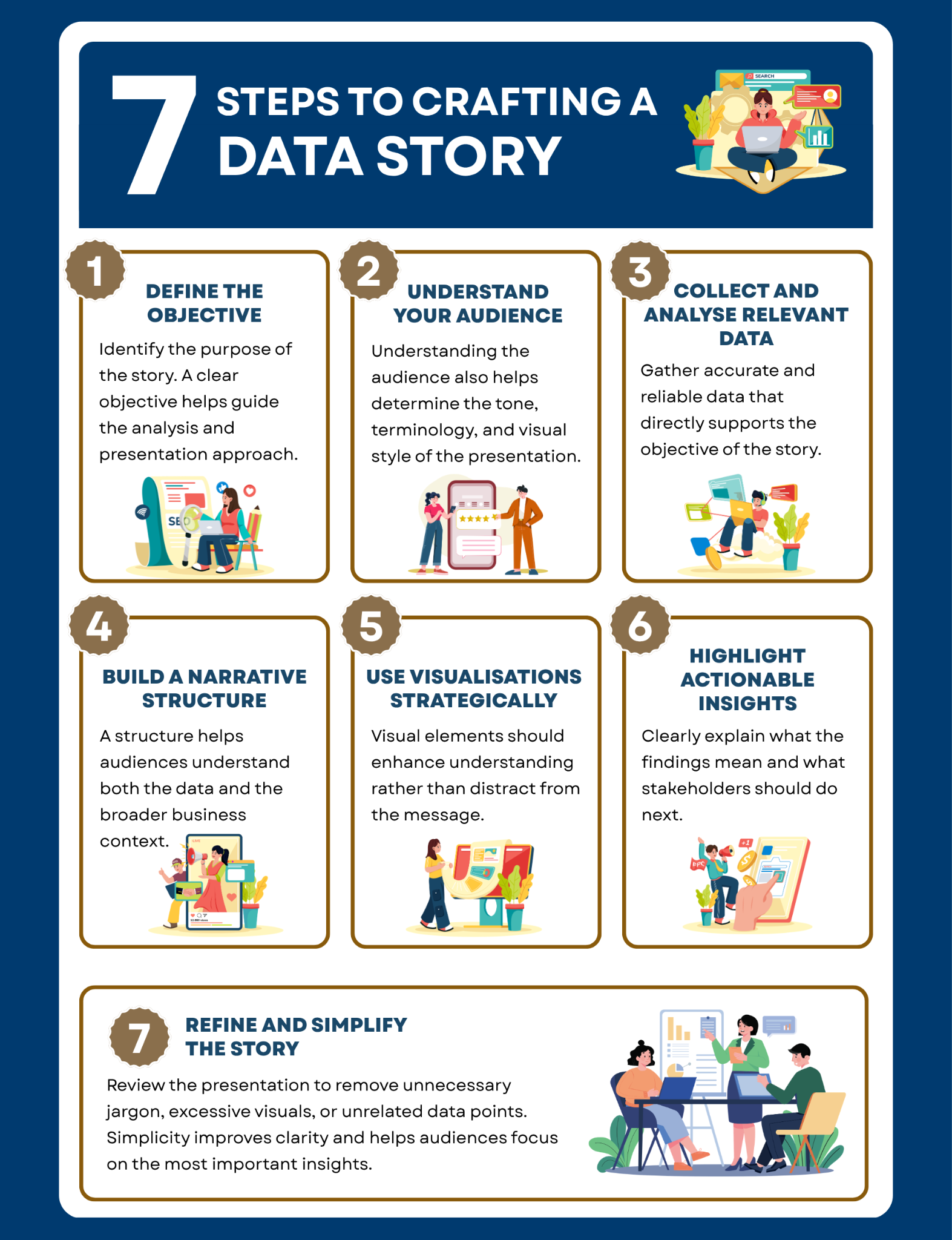
Step 1: Define The Objective
Start by identifying the purpose of the story. Determine whether the goal is to explain performance, influence decisions, highlight risks, or recommend actions. A clear objective helps guide the analysis and presentation approach.
For example, a sales manager may want to look into the customer journey to explain why retention rates have declined over the past quarter.
Step 2: Understand Your Audience
Different audiences require different levels of detail and context. Senior executives may prefer concise strategic insights, while operational teams may need more detailed explanations and supporting data.
Understanding the audience also helps determine the tone, terminology, and visual style of the presentation.
Step 3: Collect And Analyse Relevant Data
Gather accurate and reliable data that directly supports the objective of the story. Focus on meaningful trends, comparisons, or patterns rather than overwhelming audiences with excessive information.
Professionals working in analytics often combine technical skills such as SQL, Excel, Tableau, or Power BI with critical thinking to identify the most valuable insights.
Step 4: Build A Narrative Structure
A strong data story typically follows a logical structure:
- Introduce the problem or question
- Present supporting evidence
- Explain the implications
- Recommend actions or next steps
This structure helps audiences understand both the data and the broader business context.
Step 5: Use Visualisations Strategically
Visual elements should enhance understanding rather than distract from the message. Bar charts, line graphs, heat maps, and dashboards can help audiences quickly identify important trends and comparisons.
For example, a customer satisfaction trend over time may be easier to understand through a line chart than a table of percentages.
Step 6: Highlight Actionable Insights
The most effective data stories lead to decisions or actions. Clearly explain what the findings mean and what stakeholders should do next.
For instance, if analysis shows declining engagement among younger consumers, the recommendation may involve adjusting marketing strategies or improving digital channels.
Step 7: Refine And Simplify The Story
Review the presentation carefully to remove unnecessary jargon, excessive visuals, or unrelated data points. Simplicity improves clarity and helps audiences focus on the most important insights.
Practising presentation delivery can also improve confidence and strengthen leadership communication during meetings or stakeholder discussions.
Data Storytelling Best Practices
Strong data storytelling combines analytical accuracy with effective communication techniques. Professionals who follow best practices are more likely to create impactful stories that engage audiences and support better decisions.
Focus On The Audience’s Needs
Tailor the level of detail, visuals, and messaging to the audience. Senior executives often prefer concise summaries and strategic implications, while operational teams may require deeper analysis and supporting evidence.
Professionals looking to strengthen these communication capabilities may benefit from SMU Academy’s Communicating Data with Impact: Data Storytelling and Visualisation course, which focuses on presenting insights clearly and persuasively.
Keep Visualisations Clear And Simple
Avoid overcrowded charts, unnecessary colours, or excessive data labels. Simple visualisations are usually more effective because they help audiences focus on the key takeaway quickly.
Courses such as Visual Narrative Using Tableau help professionals learn how to build effective visual stories that communicate insights more clearly.
Combine Data With Business Context
Data alone rarely creates impact without context. Explain why the findings matter to the organisation, customers, or industry trends.
For example, instead of simply reporting declining website traffic, explain how the trend could affect revenue growth, customer acquisition, or market competitiveness in the digital economy.
Use Tools That Support Storytelling
Modern analytics platforms such as Tableau and Power BI make it easier to create dashboards and interactive visualisations. However, tools should support the narrative rather than become the focus of the presentation itself.
Professionals interested in dashboard storytelling can explore SMU Academy’s Creating and Using Business Dashboard Visualisation for Decision Support Using Power BI and Artificial Intelligence (AI) Co-Pilots course.
Develop Both Analytical And Communication Skills
Effective data storytelling requires a balance of analytical ability and interpersonal communication. Professionals need to interpret data accurately while also explaining findings in ways that influence action.
Programmes such as the (SCTP) Advanced Certificate in Data Communications and Visualisation for Business Analyst and Advanced Certificate in Applied Data Analytics Module 5: Business Intelligence and Storytelling with Visualisations can help professionals strengthen these capabilities.
The Growing Importance Of Data Storytelling
As businesses continue to rely on analytics and digital transformation, data storytelling has become an increasingly valuable capability across industries. It helps organisations turn complex information into meaningful insights that support better communication, collaboration, and decision-making.
From public sector communication to business strategy and media reporting, strong data storytelling enables professionals to present information in ways that audiences can understand and act upon. It combines analytical thinking with communication, leadership, and presentation abilities, making it highly relevant for many of today’s highest paying jobs in Singapore.
By developing both technical and storytelling capabilities, professionals can strengthen their ability to influence decisions, engage stakeholders, and create greater business impact in an increasingly data-driven world.
FAQs About Data Storytelling
What are some key skills for data storytellers?
Effective data storytellers typically require a combination of analytical, communication, and presentation skills. Important capabilities include data analysis, critical thinking, visualisation design, audience understanding, and storytelling techniques. Strong soft skills and leadership abilities are also important when presenting findings to stakeholders or decision-makers.
What is the difference between data storytelling and data visualisation?
Data visualisation focuses on presenting data through charts, graphs, or dashboards. Data storytelling goes a step further by combining visuals with narrative structure and business context to explain what the data means and why it matters. In simple terms, visualisation shows the data, while storytelling explains the insight behind it.
What are some common data storytelling mistakes to avoid?
Some of the most common data storytelling mistakes include:
- Including too much data and overwhelming audiences
- Using visuals without explaining the key insight
- Ignoring the audience’s level of understanding
- Presenting statistics without proper context
- Ending without clear recommendations or next steps
What are some key tools and resources to improve data storytelling?
Popular tools include Tableau, Power BI, Microsoft Excel, Google Looker Studio, and Python visualisation libraries such as Matplotlib or Plotly. Professionals can also improve their skills through specialised training programmes, online courses, industry case studies, and practical experience working with business data.